Turning Data into Insight is a Skill. Almost an Art Form.
Most People Regurgitate Data into Graphs and Tables, and Call it Insight. It is Not. It is Nicely Presented Data.
Data and insight is the difference between a graph showing the population of a country growing every time, year by year, versus the insight that the biggest growth was in the last 5 years and was caused by a lockdown. One is data made to look presentable, and the other is a useful piece of information – an insight. This provides real understanding and enabling people to make better decisions from the data insight.
Understanding the Differences Between Data Observations and Data Insights
Clarification on what is and what isn’t insight:
The difference between observations and insights is an important one. Observations are just raw data: things you saw and heard — what you recorded without judgment. They are trends, patterns of behaviour, but merely the ‘what’.
Insights are a deeper interpretation and understanding of what you are seeing and hearing. Insights make sense and meaning out of your observations. All too often we use observations as our key points when presenting information. They become the headlines on our slides, like ‘Population Growth from 1990 to 2020’, the content we share, the point we try to get across, and yet they are the ‘so what’. Insight is then required because insights fully explain situations, bring them to life, and give the audience a deeper and more meaningful understanding.
The What – Observations
- This is raw data.
- The things you see and hear.
- Information without context.
- The trends and patterns of behaviour.
- Observations are your building blocks towards insights.
An example observation: Market share is up 3% points as frequency increases.
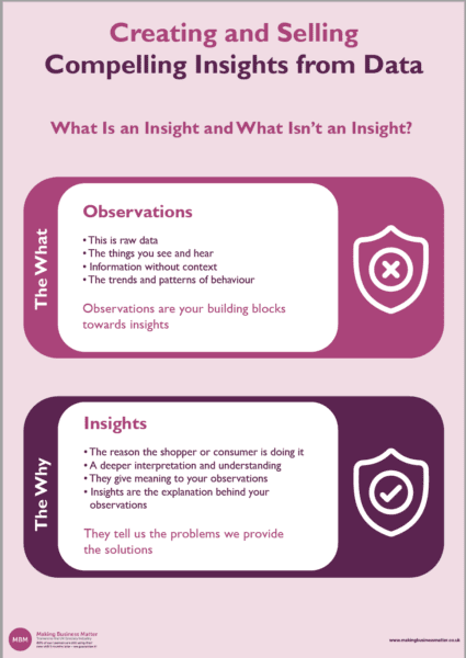
The Why – Insights
- The reason the shopper or consumer is doing it.
- A deeper interpretation and understanding.
- They give meaning to your observations.
- Insights are the explanation behind your observations.
- They tell us the problems we provide the solutions.
An example insight: Shoppers buy low-calorie flavoured carbonates more frequently than regular variants. As they are seen as a more permissible treat to enjoy more often.
1. How to Create Insights Based on Observations
The approach most people take is to dive straight into the data. More often than not, this is a black hole, and they get sucked in and lost for hours. Observations are a great basis for insights, but they need to be laddered up by first asking more questions. As a first rung on the ladder, consider writing a hypothesis to test. This hypothesis becomes the lens you use to look through.
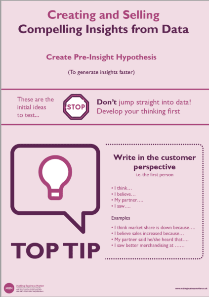
Write your hypothesis from the customer perspective i.e. the first person and as questions. For example:
- 1. “I think….”
- I think the consumer is spending 10% less on product A – are they?
- 2. “I believe…”
- I believe we have lost 33% of shoppers to Retailer B – have we?
- 3. “My partner…”
- My partner has traded up to Product C (Are other people also?).
- 4. Market share is up because…
- Is market share is up because we have attracted 10% more buyers?
- 5. Sales are down because…
- Are sales are down because people are buying less frequently?
- 6. The Category is growing because…
- Is the Category is growing because of our shift to less plastic packaging?

Aim to then prove or disprove your initial hypothesis (Hippos) using the data available to you. From there you can delve deeper as you confirm, or not, your initial hippos, and then develop additional hippos. Continually testing your new and upgraded hippos using the data.
This approach of creating hippos is powerful because:
- It provides good stimulus – i.e. it gets you thinking and discussing it with others.
- It must be validated – Don’t believe you know the answers, don’t rely on gut feelings or intuition, and use facts from data only.
- You will save time from jumping into the black hole of data and expecting the answer to magical reveal itself.
2. How to Use the 3W’s Model to Validate Your Insight
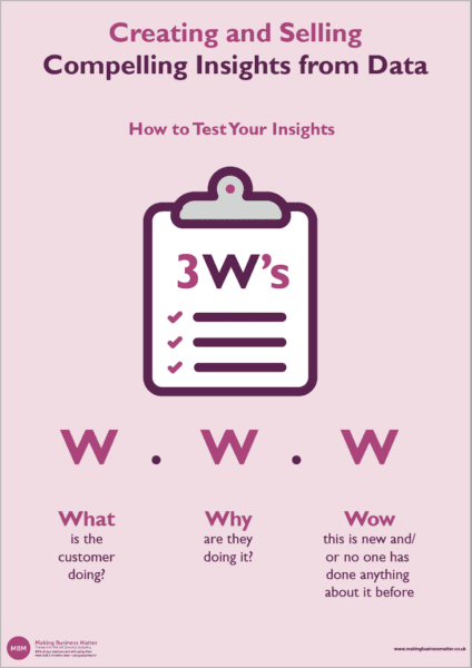
Use this simple model – the 3 W’s – To test if an insight is a true insight or whether it is just an observation. Ask these 3 questions of the insight and see whether it answers the questions:
- What is the customer doing?
- Why is the customer doing it?
- Wow! No one had noticed this before or done anything about it.
You can use this simple yet effective checklist to ensure that you are communicating insights. That you have the initial observations (what you saw), the insight (why it is happening), and a wow to ensure it is new and/or nothing has previously been done about it.
Examples that Use the 3W Model and those that Don’t:
Below are a few examples; 3 good ones and 2 bad ones:
Good Examples
Shoppers brought 10% more of Product A in retailer X…
- …because we had spoken to the shoppers and understood that 75% of them wanted more choice and a healthier alternative…
- …so we launched a low sugar variant to meet this need.’
‘Consumer penetration increased by 4% attracting more family shoppers into Product B…
- …because we understood the need and trend towards reduced plastic packaging…
- …so we launched a market first, better value larger pack in a paper bag.’
‘Shopper’s frequency of Product C increased by 10% in our 50 store trial…
- …because we understood the purchase decision hierarchy and shopper’s desire for ease of shop…
- …so we changed the location of the product in all stores to sit adjacent to complementary products.’
Bad Examples
‘Shopper’s brought less of Product D…
- …we don’t know why…
- …so we changed nothing and sales will continue to decline.’
‘Shopper’s traded out of Product E to Product F…
- …We made no changes and have no idea why…
- …so we will wait and see if it completely dies.’
3. How to ‘Ladder Up’ Further – Questioning Techniques to Identify More
Here are example questions to help you ladder up/develop your observations into insights quicker:
- Why are they doing that?
- How do they feel about it?
- What are they thinking?
- Why do you do that?
- What was the outcome?
- How frustrating is that?
- How does this compare to other categories?
- When did you see that?
- How does this compare to the total market?
- Do we have more or less customers? (penetration)
- How does this compare to other products?
- Are customers buying more or less often? (frequency)
- Are our customers spending more or less per trip? (trip spend)
- Are our customers buying more less volume per trip? (trip volume)
- Has customer spend moved to a different retailer?
- How has market share changed?
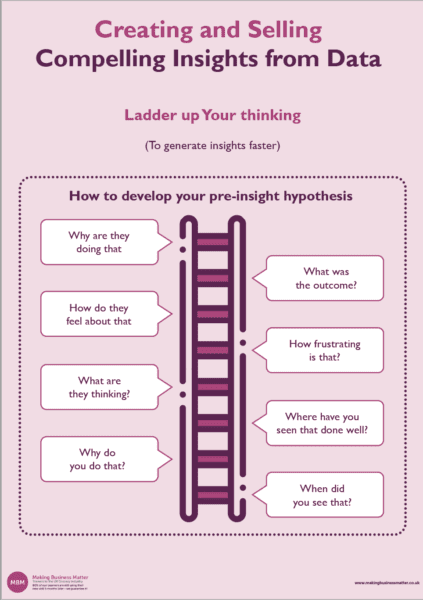
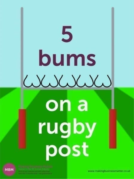
I suggest you consider other questions to help you develop your insights. Start with… What, Why, When, Where, How, Who …to get you started. The ‘5 Bums on a Rugby Post’ is a great mnemonic to help you remember how to prod and poke your hippos to arrive at some great insights.
4. Validating and Valuing the Opportunity Size
This tool enables you to move away from that elusive number and manage people’s expectations when estimating numbers. The P.R.O. tool stands for:
- Pessimistic
- Realistic
- Optimistic
The P.R.O. Tool:
- Very useful for providing a range of numbers that collectively indicate the opportunity without…
- …having to be absolute.
- Allows for discussion – which is where the true value comes from – because the discussion doesn’t become about arriving at an exact number and does become more about working towards delivering that number, the opportunity.
Using the PRO Tool
When you need to estimate a number you do so on 3 levels; The pessimistic estimate, the Realistic estimate, and the Optimistic estimate. Plus, include some commentary with each number. This is an example, taking the example of estimating an opportunity in a category for a Category Manager regarding trying a new promotion:
- Pessimistically – The uplift will be +10%.
- This uplift is based on a similar category having tried the similar promotion.
- At this level of uplift we we lose £110k on the promotion. To mitigate this, we will assess the uplift for the first 3 days, and if the uplift is at +10%, we’ll change the promotion to a different mechanic.
- Realistically – The Uplift will be +70%.
- This uplift is based on a sub category having tried this promotion.
- At this uplift uplift we will gain +£62k. If this happens I suggest that we leave the promotion to run and monitor it.
- Optimistically – The uplift will be +110%.
- This uplift is based on taking the realistic figure and factoring in the additional point of sale we plan in-store.
- At this uplift uplift we will gain +£420k. If this happens I suggest that we leave the promotion to run and monitor it.
Read further about estimating numbers to understand more about the PRO tool and how you cam better manage people’s expectations.
5. How to Presenting Your Findings
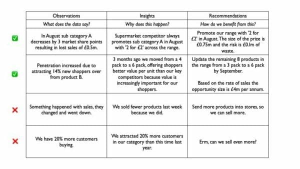
A very useful technique for presenting your findings is the RIO technique. This technique stands for; Recommendations, Insights and Observations. It is a means of structuring your findings to ensure that you have laddered from observations to insights to recommendations.
Observations
In the Observations column you share what you have seen in the data.
Insights
In the Insights columns you share what insights you have seen in the data.
Recommendations
In the Recommendations column you share what you recommend how you should both act upon these insights.
By using the Rio template you are ‘forcing’ yourself to move from just sharing what yo have seen all the way through to what action you believe should be taken in order to seize the opportunity. A word of caution: Recommendations should NOT be flaky, weak, and general, leaving the Buyer/audience with a task to do that is unclear. The recommendations should be specific, time bound and possibly hard to implement, the audience must know exactly what is required.
A bad recommendation is:
‘Improve the ranging on the sub-category of xyz, to achieve the £1.3m opportunity’.
A good recommendation is:
‘Change the promotion from 3 for 2, to 20p off in order to test whether new shoppers are attracted to the promotion’.
The RIO Template with Good and Bad Recommendations
Click the image for a larger resolution.
In the last two rows above you can see the bad examples. They are bad because if you were the audience, or the buyer, and then took away an action to ‘Send more products into stores’, you’d do nothing because it is too generic, too obvious, and would generate no motivation to make a change because the change would make no difference.
6. Don’t ‘Apple and Apple’
When presenting most people make the mistakes of saying what their slides says. For example:
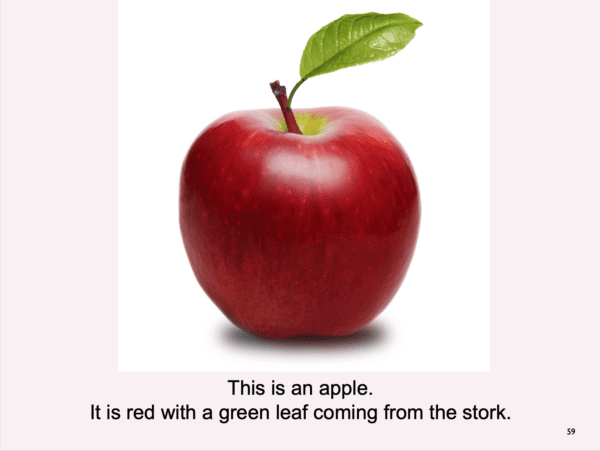
They present a table or graph and tell the audience what it is. The audience can tell what it is. Your role as the presenter is to make the words complement the image, like this:
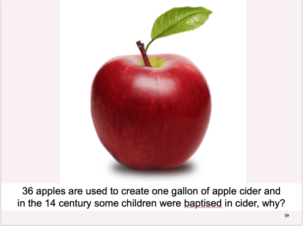
To be a really engaging presenter, don’t write the text on the screen, but remember it, show the image of the apple and then say it.
7. Advanced Data Insights
The first change is to recognise the difference between observations and insights and the power of an insight over a piece of data. Data is still needed. It it just the stepping stone to the next level – insight.
In this Lego graphic below we highlight the 7 stages from Data to Evaluation (You can click the image below to access a high resolution PDF version):
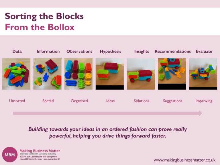
The metaphor is about moving from unsorted to improving. 7 steps that a Category Manager needs to understand because most Category Managers and insights analysts are still at stages 1, 2, or 3, without knowing that there are 4 further stages in becoming excellent at data insights.


